Digital Promo Tag Integration Sprint
To support an in-store signage overhaul, Kroger’s marketing and digital teams partnered to ensure new promotional labels like Price Drop and Everyday Low Price were clear, intuitive, and consistent across platforms. My role spanned from sprint strategy through final usability testing and insight synthesis.
Tools: Mural, Figma, Dovetail, UserZoom
THE PROBLEM
Kroger’s in-store promotional signage was being updated to feature simplified language and new visual treatments for tags like “Price Drop” and “Everyday Low Price.” To maintain a cohesive customer experience, the digital team needed to explore how these changes should be reflected online. While the current digital experience wasn’t broken, there was no clear approach for how the new promotional language and visual treatments would carry through to web and app.
THE SOLUTION
The team launched a sprint to create and evaluate digital versions of the new promotional tags. Two visual concepts were tested with customers to understand how effectively each design communicated savings. Insights from usability testing shaped the final design direction and ensured consistency across in-store and digital touchpoints.
MY ROLE
UX Research - Led UX research to evaluate two promo tag concepts in partnership with design. Collaborated on aligning research goals, reviewed early design explorations, and delivered clear insights and a recommendation to move forward.
Background
As part of an updated promotional strategy, Kroger’s marketing team introduced simplified, color-coded signage to improve how in-store savings are communicated. This included evolving how terms like “Price Drop” and “Everyday Low Price” (EDLP) appear across printed tags, digital signage, and shelf displays.
📌 This shift aimed to create a clearer, more unified way of presenting savings across the store — but it also raised a new question:
How should these changes be reflected in digital shopping experiences?

The Digital Concepts
To align with the new in-store signage, the digital team explored two visual treatments for how promotional tags like “Price Drop” and “Everyday Low Price” should appear on product cards across the site. While the content stayed the same, the two concepts differed in their visual styling — including color, iconography, and layout emphasis.
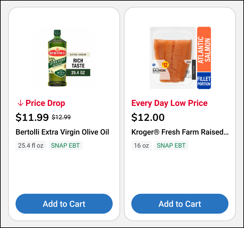
Concept 1
Promo tag appears directly next to the price
Includes a downward arrow icon to reinforce the “Price Drop” message
Uses red text on a white background for better readability
Designed to feel clean, familiar, and easy to scan
Styling closely resembles traditional in-store signage
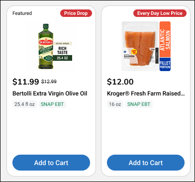
Concept 2
Promo tag is shown above the product title, under the image
Uses white text on a bold red background to create stronger contrast
Does not include an icon, relying instead on visual weight
Intended to stand out quickly in visually crowded modules
Styling draws from retail flash sale or urgency-driven cues
Test Planning & Collaboration
After the two visual concepts were finalized, I partnered with the design team to structure and execute a focused round of usability testing.
My role at this stage included:
Bringing together the current experience and new visual concepts
Drafting key research questions across visibility, usability, and perception
Identifying critical assumptions we wanted to validate
Collaborating with designers to define the screens and interactions needed for testing
This alignment ensured we were testing the right things — not just what looked better, but what actually helped customers notice and understand savings information in a real browsing context.

A snapshot of the Mural used to collaboratively plan research scope, frame assumptions, and map out test screens.
Test Structure
To evaluate how effectively the two visual promo tag concepts communicated savings, we ran an unmoderated usability study that combined click tests, open-ended questions, and a final concept preference task.
The study was designed to surface both natural behavior (what users notice on their own) and focused performance (how quickly and accurately they can find promo tags when asked).
We used a combination of quantitative measures like time on task and success rate, along with qualitative insights from open-ended responses, to guide our recommendation.
Task 1: Identifying Savings Opportunities
Do users notice the new promo tags when browsing naturally?
Task 2: Selecting Important Savings Info
Which savings indicators do users prioritize when scanning a page?
Task 3: Understanding Label Meaning
How do users interpret “Price Drop” and “Everyday Low Price”?
Task 4: Finding Promo Tags
Which concept performs better when users are told exactly what to look for?
Task 5: Side-by-Side Comparison
Do users recognize the visual differences between the two concepts?
Task 6: Design Preference
How do users interpret “Price Drop” and “Everyday Low Price”?
Key Findings
🔹 Users rarely noticed promo tags on their own
In unprompted tasks, users focused on familiar savings areas like Digital Coupons and the Weekly Ad. Engagement with the new Price Drop and Everyday Low Price tags was low — under 3% of clicks in Concept 1 and 2–3% in Concept 2
🔹 Concept 1 slightly outperformed — but Concept 2 was competitive when filtered
In the prompted click test:
Concept 1 had a 66% success rate (median time: 27s)
Concept 2 had a 55% success rate (median time: 26s)
When filtering to successful participants, Concept 2 actually had fewer off-clicks and stronger digital promo tag recognition:
EDLP: 48% (Concept 2) vs. 45% (Concept 1)
Price Drop: 45% (Concept 2) vs. 39% (Concept 1)
This suggests that both concepts performed similarly under focused attention, with Concept 2 recovering well after initial broad-task underperformance.
🔹 The language itself made sense to most users
Once prompted, users accurately defined both “Price Drop” and “Everyday Low Price” — describing them as temporary markdowns and consistent value pricing, respectively.
🔹 Preferences were split — clarity vs. contrast
Design preference was nearly evenly split across 200 participants:
Concept 1: 45.5%
Concept 2: 45.0%
Neither: 9.5%
Participants liked Concept 1 for its clearer text and arrow icon, and Concept 2 for its bold background and stronger visual presence.
“I liked that the red text stood out next to the price — it was easy to see.”
“The bold red tag caught my eye first when I was scrolling.”
✅ Feedback showed users responded to visual clarity, not brand consistency — with contrast, placement, and readability driving preference.
Recommendation & Outcome
Since neither concept emerged as a clear winner, our recommendation was to move forward with the design that offered the best implementation feasibility while still aligning with the updated in-store promo strategy.
Concept 1 slightly outperformed in initial recognition and was praised for its clarity
Concept 2 had strong performance among successful participants and was more visually bold
User preference was split, reinforcing that either direction could be viable depending on business and technical constraints
We recommended selecting the design that could be most easily implemented — and then validating it again post-launch through performance tracking.
Next steps included:
Reviewing implementation complexity with engineering
Making a final decision with design and marketing stakeholders
Monitoring promo tag performance in live environments
🔗 View the full research readout for task-level results, user quotes, and data analysis
25.Q1 Digital Promo Research Summary (PDF)
My Role in the Outcome
I delivered the research findings in a structured format that allowed stakeholders to weigh data-backed tradeoffs alongside technical considerations. By framing the insights around clarity, performance, and perception — not just preference — I helped shift the conversation from “Which looks better?” to “Which works best in practice?”