
The Problem
The Solution
The Impact
Where We Landed
A systematic approach to component architecture that balanced brand aspirations with customer needs, setting the foundation for scalable design systems.
Key Architecture Decisions
Base vs. Contextual Atoms
Defined always-present elements (image, title, price, CTA) versus context-specific atoms (savings zone, inventory, nutrition) that adapt to journey needs.
Savings Visibility Preservation
Advocated for maintaining savings prominence despite brand pressure.
Standardized Specifications
Created unified sizing (200x438px grid cards), typography (13.5px Roboto titles), and interaction patterns across all platforms.
Future-Ready Foundation
Architecture designed for AI-powered documentation and self-serve governance, enabling teams to query guidelines conversationally.
My Role & Approach
As Design Lead, I drove the systematic audit and stakeholder alignment that laid the foundation for Kroger's component system, later exploring AI-powered documentation approaches.
Documented inconsistencies
Quantified impact
Synthesized requirements
Built consensus
Ideated on evolution with new technology
Advocated for users
Key Responsibilities
- ✓ Led component audit across web, iOS, Android
- ✓ Facilitated stakeholder synthesis workshops
- ✓ Defined atom-level architecture
- ✓ Built Qualtrics monitoring framework
- ✓ Preserved customer-first decisions
- ✓ Explored AI-powered documentation (2025)
Evidence-Driven Design:
I transformed subjective brand preferences into objective decisions through systematic audits and stakeholder research, ensuring every component choice was backed by user needs and business impact.
The Process
From fragmented implementations to unified architecture through systematic discovery and stakeholder alignment
Systematic Component Audit
Beginning in March 2020, I led a comprehensive audit documenting every product card variant across web, iOS, and Android. The goal: identify existing atoms and create a single source of truth for all product cards to increase visual and functional consistency.

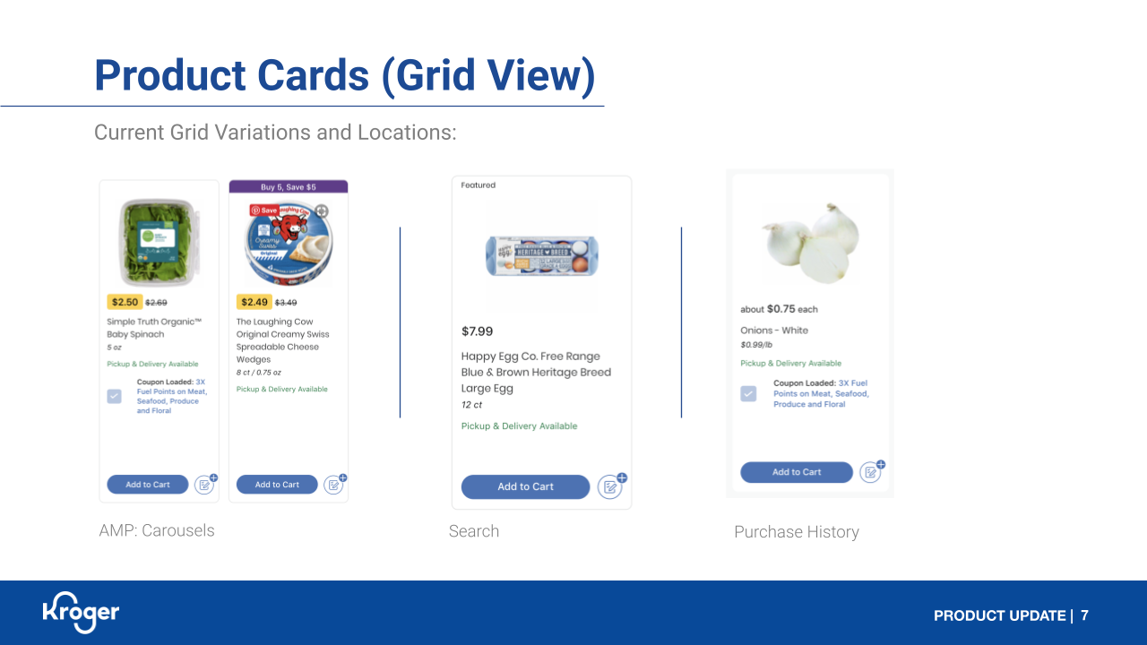
Grid variations across touchpoints

Atoms breakdown & inconsistencies

Row card fragmentation
The Real Cost of Inconsistency
With zero shared logic between 12+ implementations, every simple change required updating each variant separately—turning a 1-day fix into a 2-week sprint across multiple teams.

Proposed unified grid requirements and mocks showing standardized 200×438px cards with consistent Roboto typography
From Components to Strategy
By June 2020, we expanded the scope from technical componentization to strategic redesign, reframing the initiative as "reinventing how customers interact, explore, and shop using product cards and PDPs throughout the customer journey."
Three-Pronged Approach
Architecture Enhancement
Componentization of PDP, PC, carousels for development efficiency
Purpose Definition
Understanding product card and PDP roles for growing customer needs
Stakeholder Collaboration
Identifying unique needs to craft holistic solutions
Key Strategic Questions Addressed
Product Cards
- Browse vast array of products
- Quick purchase decisions
- Comparison at scale
- List building & cart management
Product Detail Pages
- Detailed product information
- Nutrition & allergen details
- In-store location
- Cross-selling opportunities
Building the Stakeholder Map
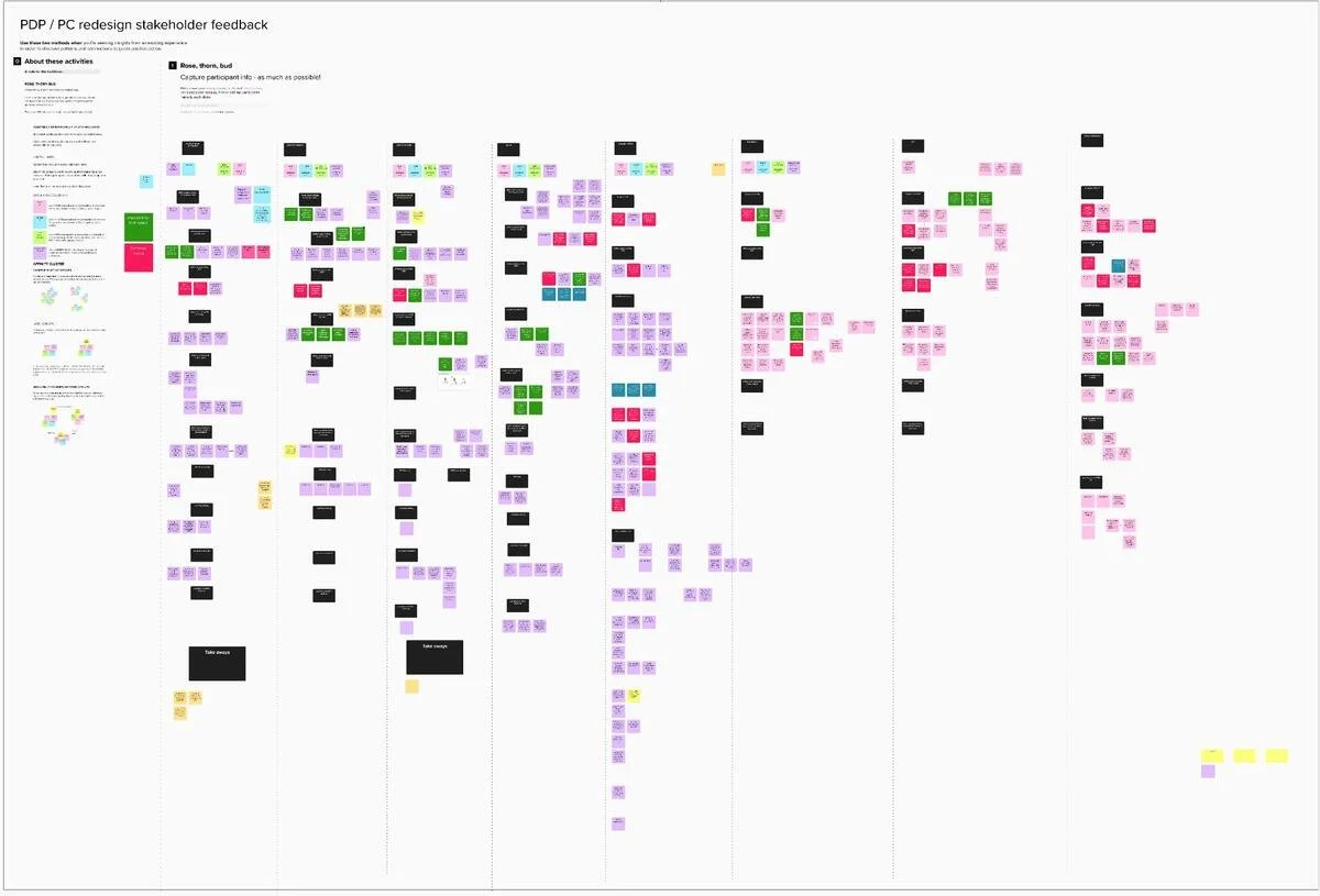
As we transitioned from technical componentization to strategic redesign, it became clear we needed to understand every team that touched product cards and PDPs. I mapped out the entire ecosystem, identifying not just who owned components, but who depended on them and who would be affected by changes.

Stakeholder synthesis board showing the complexity of requirements across Savings, Core, Cart/Checkout, Opt Up, and other business units
Stakeholder Interview Deep Dives
With the ecosystem mapped, I conducted 1:1 deep-dive interviews with each stakeholder group to understand their unique business needs, use cases, and how customers interact with product cards and PDPs in their specific feature spaces.
Raw Notes from 1:1 Interviews
Complete documentation of 300+ individual requirements and feedback points captured during stakeholder interviews
Analysis & Synthesis

Organized synthesis across five key areas: Definition, Goals & Use Cases, Most Important Info, Areas for Improvement, and Next Steps
Critical Discoveries from Synthesis
Universal Priorities Emerged
Despite diverse needs, three elements emerged as "Overall Most Important Info" across all teams:
- Product Image
- Price (with savings visibility)
- Primary CTA
Conflicting Requirements
Each team's unique needs sometimes conflicted:
- Savings: Maximize coupon visibility
- Core: Clean, uncluttered design
- Cart: Special instructions prominent
- Search: Fast load times
Roadmap & Workshop Planning
With stakeholder needs documented, we developed a comprehensive roadmap that balanced immediate technical needs with longer-term strategic initiatives. The planning process involved multiple workshops to align teams on priorities and dependencies.

Complete workshop planning and roadmap showing the journey from stakeholder interviews through design definition, with detailed breakdowns by feature area and mood boards for visual direction
Workshop Outcomes
Definition Alignment
- Clear PC vs PDP purpose statements
- Key themes across stakeholders
- Unified goals and use cases
Next Steps Defined
- Testing/Research priorities
- Discovery activities by team
- Questions for Kaisa/Heather validation
The Digital Style Guide Shift
Just as we were ready to move into design iteration and testing, our focus shifted to collaborating with the Coupons team on a card style that would incorporate the new Digital Style Guide (DSG). This pivot allowed us to test component principles within a focused use case while the broader organizational design system was being developed.
Key Contributions That Persisted: The audit methodology exposed the true scope of fragmentation. The stakeholder alignment process became the template for future cross-functional initiatives. The component architecture informed the DSG approach to product cards.
The Foundation
While the full componentization vision evolved into focused DSG collaboration, the systematic approach to understanding fragmentation and aligning stakeholders created lasting change. The work continues to influence how Kroger approaches design system decisions.
Future Vision: AI-Ready Guidelines
In 2025, after watching the IxDF masterclass "AI for Design Systems," I explored how to transform static documentation into living, conversational systems.
Knowledge Retrieval
"What do we know about savings visibility on product cards?" → Agent pulls tagged evidence from Dovetail, surveys, interviews.
Governance Automation
Stakeholder proposes change → Agent checks precedent, drafts rationale doc, and routes for review automatically.
Real-Time Validation
Figma plugin checks compliance against rules in real-time, flagging issues before design review.
From Static PDFs to Living Knowledge
The next version of product card work won't be a deck—it will be a conversation. Teams self-serve answers, proposals draft themselves, and designers reclaim time for strategy instead of documentation maintenance.