Savings & Rewards
Kroger Weekly Ad Selector
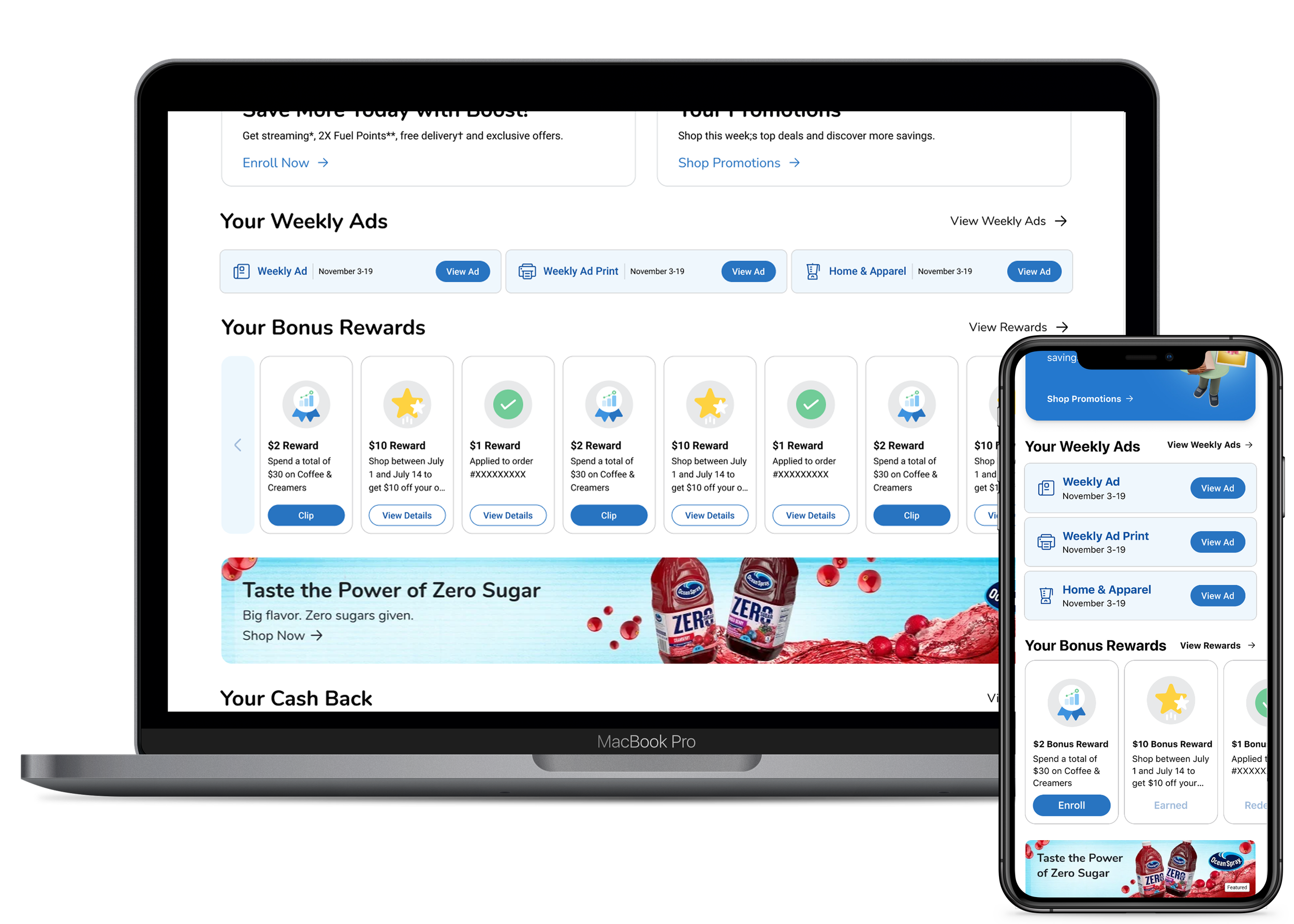
Making the Weekly Ad entry point work for customers, not just the Print ad. Nine days from kickoff to governance approval, shipped across iOS, Android, and Web in April 2025.